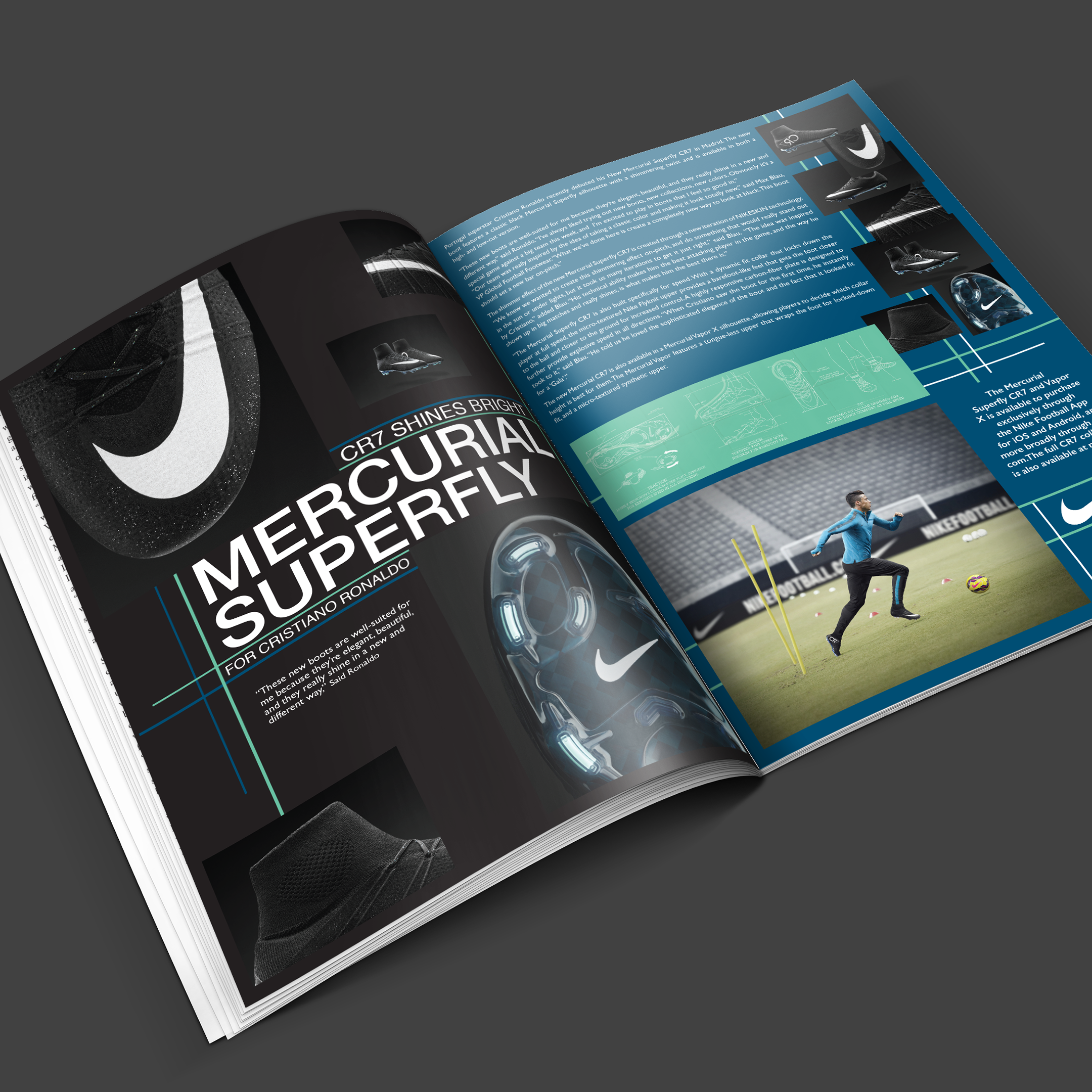
Project Brief
I had the opportunity of creating a distinctive brand identity for Ashford Housing. The primary objective was to cultivate a compelling brand persona, seamlessly integrating Ashford's rich heritage and core values. This design not only captures the essence of Ashford but also effectively communicates the advancements in housing and funding opportunities tailored to safeguard the well-being of Ashford's senior community.
Roles
Graphic Designer
Project Specifications
Duration: 10 weeks
Tools: Illustrator
Understanding the Brand and the Client's Objectives
The main objective of the Ashford Housing project was to rejuvenate its brand identity through the replacement of the outdated logo and the proficient communication of the organization's mission. The mission of the Ashford Housing Authority is to enrich the Ashford community by establishing and maintaining secure, comfortable, and affordable housing. This initiative aims to cultivate stability and foster increased self-sufficiency, specifically targeting elderly and disabled individuals with low to moderate incomes.
Initial Concepts
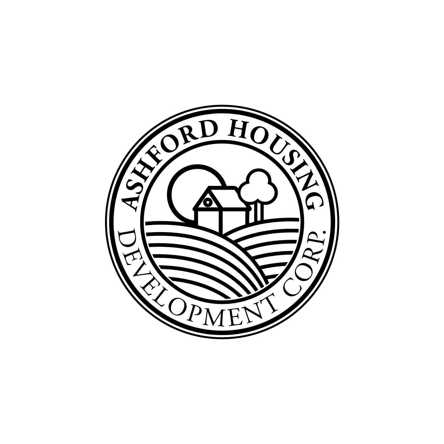
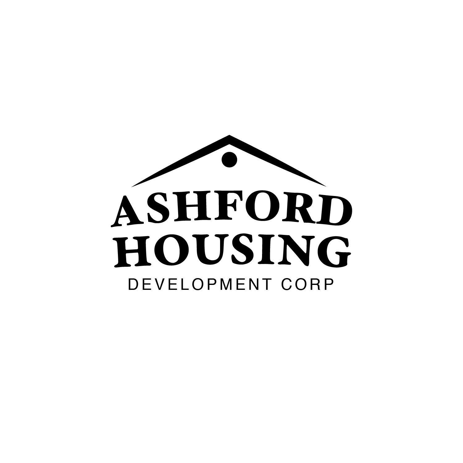
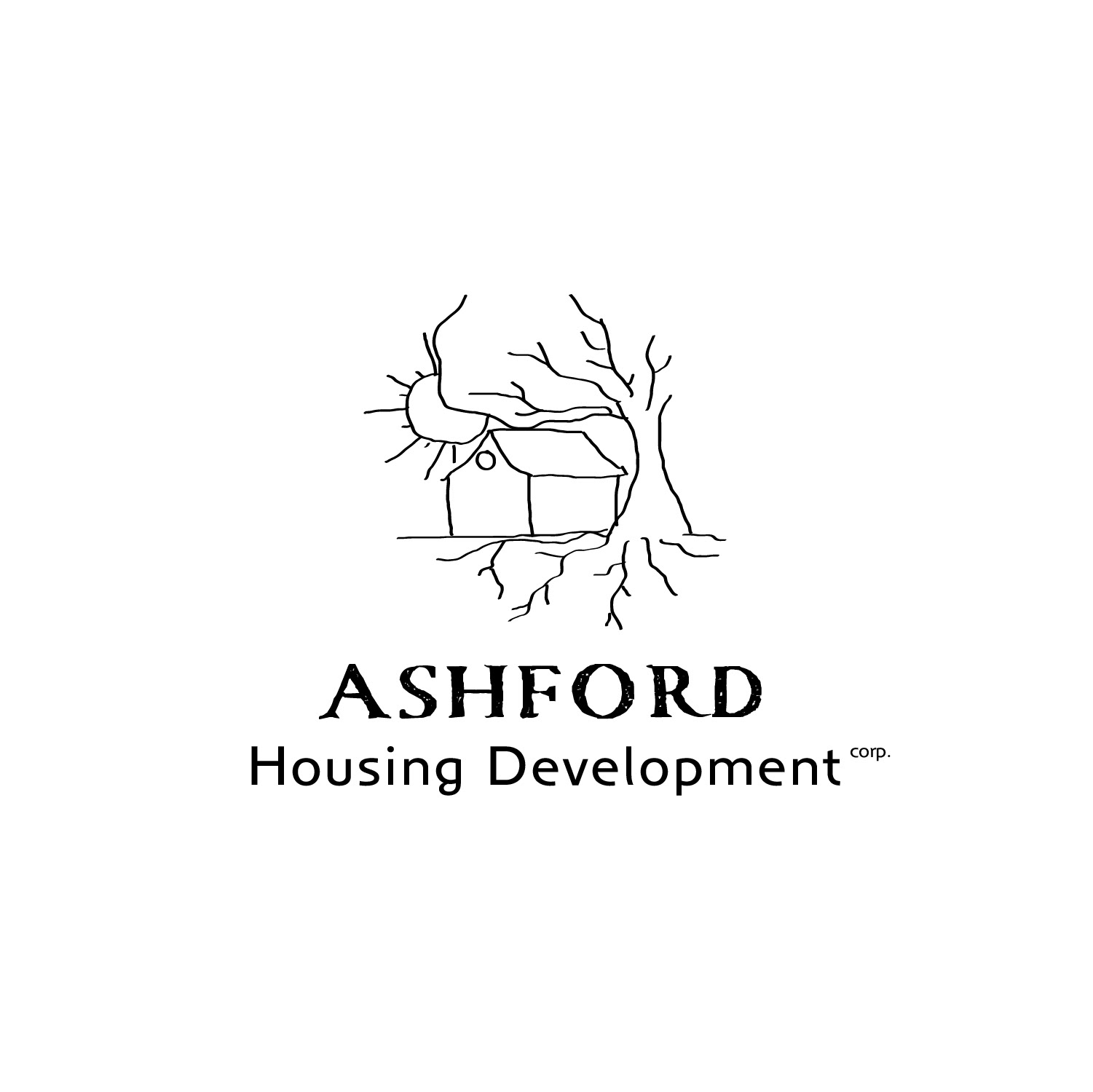
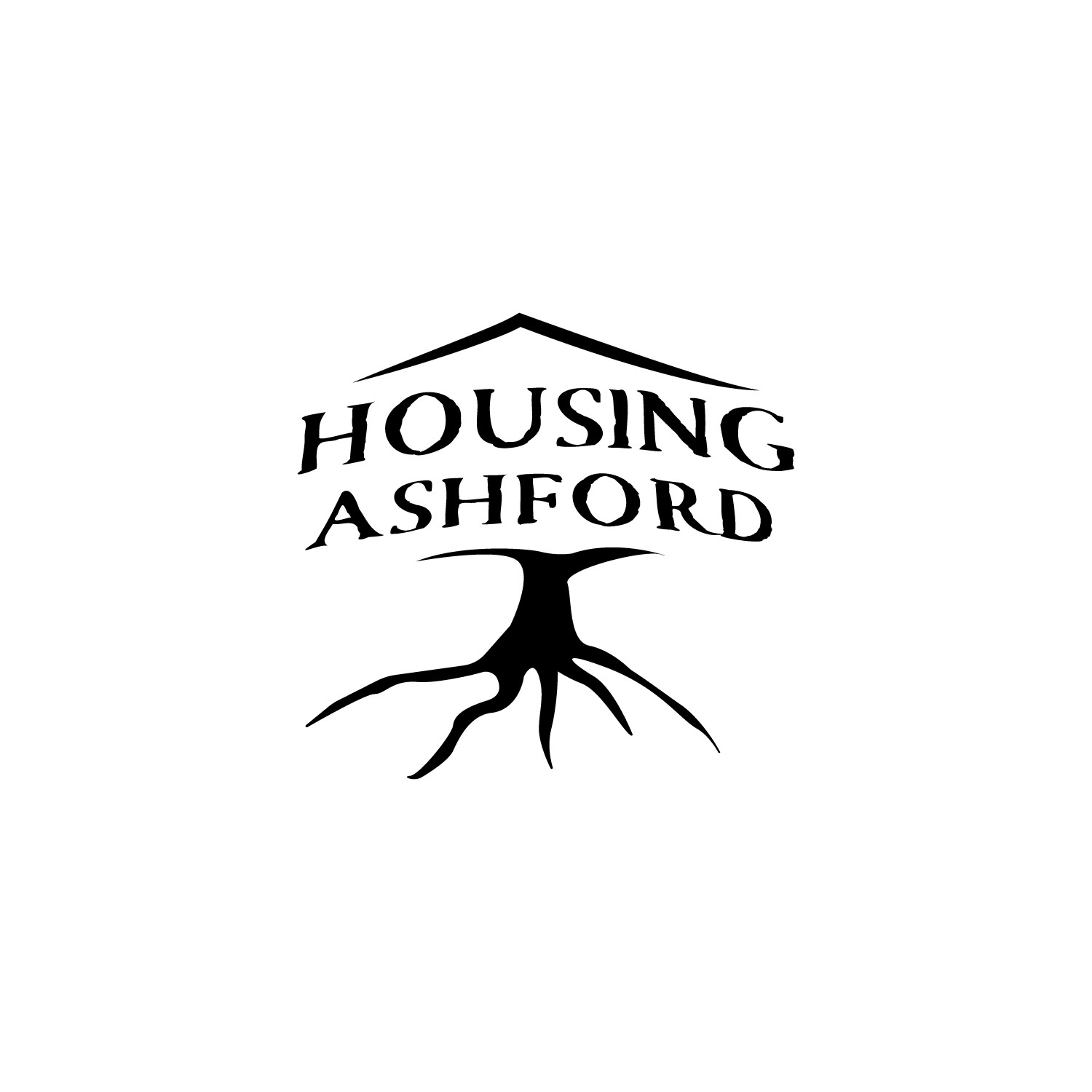
After the initial client meeting, it became clear what they were seeking in terms of the visual identity for the organization. Considering Ashford's small community setting, they expressed a preference for a logo that embraces simplicity, emanates a homely feel, and is both friendly and easily understandable.
To refine their vision and gain a clearer direction of their preferences, I generated a few ideas that aligned with their initial feedback.


Second Round of Concepts
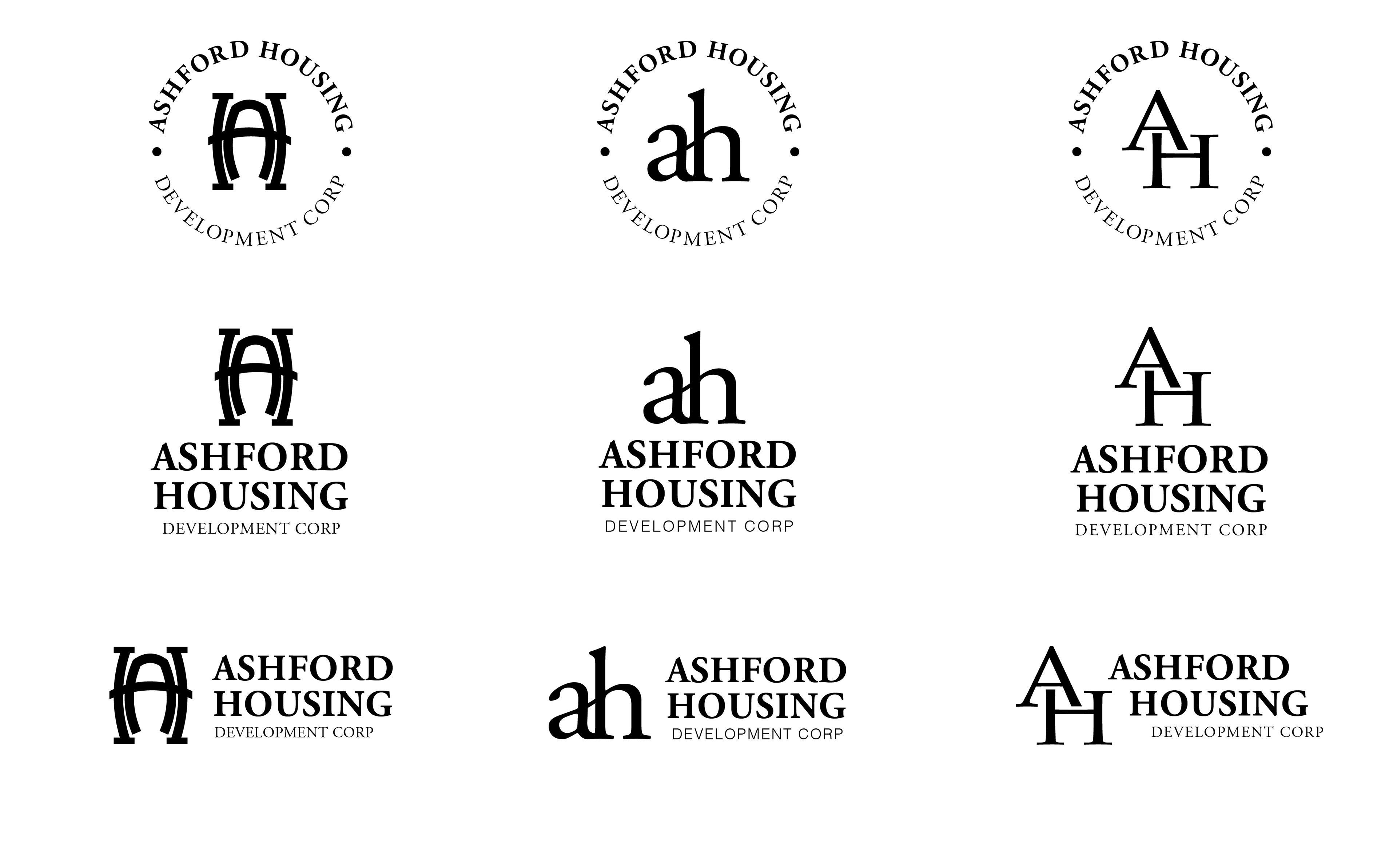
Following feedback from the initial round, I developed a second iteration of concepts, focusing on the elements that resonated most with the client. Notably, the circle shape and the arrangement of words around it emerged as favored components. The client expressed a preference against incorporating trees, houses, or other shapes in the central area, opting instead to explore a monogram approach featuring the letters A and H to represent Ashford Housing.
Final Concept and style guide
In response to the feedback received in the second round, I successfully crafted the ultimate concept, which garnered approval from the client. The final logo encapsulates Ashford Housing's steadfast dedication to aiding those in need, symbolizing unity, wholeness, and inclusivity.
The robust circular emblem, combined with a timeless serif font, establishes a harmonious equilibrium, seamlessly connecting classic heritage with a contemporary impetus for innovation, propelling Ashford forward into the future.
